TASK 3: MUSIC MAGAZINE ANALYSIS
FRONT COVERS
 |
| POP |
This is a POP billboard magazine establishing the well-known celeb 'Katy Perry' as the center of focus. The Masthead of billboard is large and bold with its featured colors in it's lettering. This use of vibrant color scheme and clear font right away makes this effective and thus this makes it recognizable as a logo as it is unique. Billboard is a flagship property for the billboard information group. This also consists of the billboard biz. Billboard.com, billboard chart alert etc. Billboard is headquartered in New York and Bureaus in London, Miami and Los Angeles, and has editorial in in huge cities around the globe. Billboard's masthead is simple. The font is easy to read, the color used for the masthead is black with the inside of the letters A and D colored in blue and yellow and it is in Sans Serif.
In the front cover of this magazine Katy Perry (the artist) is looking directly at the camera; this connotes that the she is trying to establish a relationship or connection with the reader. The artist is presented 'as the queen of pop'. The magazine has used medium shot, she looks flawless and it is well-represented. The use of the color scheme pink background and mainly black lettering, few yellow and white lettering detonates that front cover as appealing much vibrant and bubbly. This connotes pop, and its shown through the use of colors and the layout of the magazine. The target audience for Billboard mainly is aimed at both gender equally around the ages of 17-29 because the layout and the contents of the magazine is mature but the font they use gives it its modern touch.
I would use some of the features of the magazine in my own music magazine front cover for instance : the unique design idea of the billboard font. I would note this as this would make my magazine stand out therefore it would be more recognizable and appealing. I would not too vibrant colors because it would make my font look confusing and the importations would not stand out much because everything would be merged into one bright magazine.
 |
| Q |
This is a Q magazine another pop genre style of magazine. Although that is the case this magazine is a contrast to the magazine above. The Q magazines logo is the largest through out the magazine and bold. The lettering is in white and the block background of it is red this makes the logo standout more featuring important with the use of red highlighted. Q is a popular music magazine published monthly in the United Kingdom.Q was founded in 1986 by Mark Ellen and David Hepworth, who were dismayed by the music press of the time. Cheryl Cole is represented and detonates as a very furious, strong, confident look to the music magazine which has a connotation of passion.
The use of dark, bold, blunt color scheme makes the front cover of the magazine appear very cool and strong. The highlight of the main image of the music artist is her lipstick dark red, and her hair-dark-black. The body language of the artist make the magazine a sense of sexy bold features. I would say the audience for this magazine would be ages of 17-20+ the layout and the contents of the magazine is mature the font they use gives as strong outlook.
I would only use the concept of how the main image of Cheryl Cole is presented which fills up the whole front cover with her face, an extreme close up. By the image taking up the whole page it leaves no dead space and creates its own different background to the page. On the other hand I would not use this the color scheme of the front cover of this magazine because for me it personally appear too blunt and vulgar.
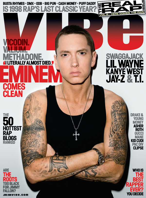 |
| VIBE |
This is a pop rap, Vibe magazine featuring the artist Eminem. The masthead is bold and the font uses capitals this instantly makes the the Vibe more dramatic and obvious. Vibe is an American music and entertainment magazine founded by producer Quincy Jones. The publication predominantly features R&B and hip-hop music artists, actors and other entertainers. In the main image Eminem is looking straight ahead at the camera with a moody , hump looking expression on his face.The shot that has been used for this cover front is a medium shot, he has a closed body posture, his arms are crossed. The use of this pose and expression connotes the 'rapper' persona of being cool and serious. Another reason being his closed body posture could be because he is showing off his tattoo's denotation the look of a rapper.
The magazine appears to be very simple yet appealing , stands out and easily readable. The magazine layout isn't overfilled with images and texts and is rather kept simple which one reason why it is aimed at late teens and young adults. Billboard magazine is an American magazine so the audience are likely to be interested in the American culture. I would the centre placement of the main image as it is more appealing and centre of attention. I would not use the simple colours I would use more variations.
WWW: You have considered positioning, fonts and connotations in your analysis.
ReplyDeleteEBI: You must refer to the subject terminology in your analysis. Please refer to my blog for the slideshare presentation on terminology of print magazines.